How much do Americans in different cities spend on restaurants? A new analysis from Escoffier reveals some insights into restaurant spending trends.
In order to examine U.S. city dining habits, Escoffier analyzed data from the USDA’s Food Expenditure Series (FES) and the U.S. Bureau of Labor Statistics’ Consumer Expenditure Surveys (CES) for 22 major metropolitan statistical areas (MSAs) around the country—and determined that, by several different measures, Honolulu is the city that spends the most on restaurants.
The analysis also revealed a number of other intriguing findings regarding the dining-out habits of Americans around the country.
But before we dive into our results, and the methodology we used to obtain them, let’s have a glance at some of the key findings. (Jump down to see our methodology)
Restaurant Spending Trends by City – Key Findings
- Of the MSAs surveyed, Honolulu ranked first in three of five categories: restaurant spending as a percentage of pre-tax income; restaurant spending as a percentage of total spending; and restaurant spending as a percentage of discretionary spending.
- Boston placed first for restaurant spending per capita, while Houston placed first for restaurant spending as a percentage of food spending.
- Miami ranked lowest of the MSAs surveyed, placing last in four of the five categories.
- Except where otherwise noted, data are presented for consumer units—a statistical unit generally analogous to the concept of a “household.”
- Restaurant expenditures encompasses all spending at full-service and limited-service restaurants, both dining in and takeout/delivery.
- Restaurant expenditures is frequently abbreviated as RE in the tables and charts below.
Restaurant Spending as a Percentage of Pre-Tax Income
The first category we analyzed was restaurant spending as a percentage of pre-tax income—in short, how much of residents’ paychecks are going toward eating at restaurants each year.
In this category, Honolulu placed first, with consumer units there spending the most both in terms of dollars spent ($3,528 per year) and in terms of restaurant expenditures as a percentage of pre-tax income (3.14%). This likely reflects the city’s higher cost of living and its strong restaurant culture, driven by its tourism-heavy economy.
Restaurant Spending as a Percentage of Pre-Tax Income
| Location | Pre-Tax Income | Estimated Restaurant Expenditures | RE as % of Pre-Tax Income | RE/Income Rank |
|---|---|---|---|---|
| National | $90,724 | $2,288 | 2.52% | – |
| Honolulu | $112,440 | $3,528 | 3.14% | 1 |
| Los Angeles | $102,649 | $3,082 | 3.00% | 2 |
| St. Louis | $89,465 | $2,617 | 2.93% | 3 |
| Philadelphia | $107,748 | $2,993 | 2.78% | 4 |
| Baltimore | $111,644 | $3,077 | 2.76% | 5 |
| Dallas-Fort Worth | $99,233 | $2,720 | 2.74% | 6 |
| Denver | $115,112 | $3,111 | 2.70% | 57 |
| San Diego | $107,182 | $2,883 | 2.69% | 8 |
| Houston | $82,382 | $2,173 | 2.64% | 9 |
| Tampa | $83,010 | $2,164 | 2.61% | 10 |
| Phoenix | $93,661 | $2,411 | 2.57% | 11 |
| Washington, D.C. | $131,821 | $3,269 | 2.48% | 12 |
| Chicago | $103,638 | $2,565 | 2.47% | 13 |
| Anchorage | $104,058 | $2,476 | 2.38% | 14 |
| San Francisco | $139,759 | $3,278 | 2.35% | 15 |
| New York | $117,048 | $2,745 | 2.35% | 16 |
| Detroit | $87,622 | $2,035 | 2.32% | 17 |
| Boston | $130,663 | $2,956 | 2.26% | 18 |
| Seattle | $123,337 | $2,697 | 2.19% | 19 |
| Atlanta | $106,699 | $2,278 | 2.13% | 20 |
| Minneapolis-St. Paul | $117,759 | $2,404 | 2.04% | 21 |
| Miami | $83,756 | $1,572 | 1.88% | 22 |
The data reveal that, as pre-tax income increases, restaurant expenditures as a percentage of pre-tax income actually decreases—even while consumer units are spending higher dollar amounts on dining out. These findings are illustrated in the chart below.
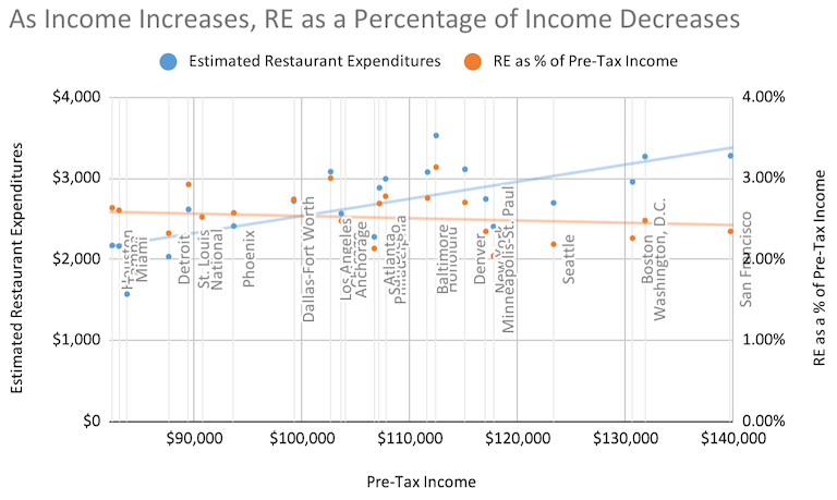
This could imply that households in higher income areas simply have more things to spend money on and, as such, allocate a smaller share of their income toward restaurants.
Restaurant Spending as a Percentage of Total Spending
Next, we looked at restaurant expenditures as a percentage of total expenditures, which allows us to put consumers’ restaurant spending in the context of all their other expenses.
In this category, too, Honolulu placed first, with consumer units allocating nearly 5% of their annual spending (4.71%) to restaurant dining. And this is on top of the fact that Honolulans have significantly higher average annual expenses than the rest of the country—7% higher than the national average. This highlights the fact that not only do the people there spend more across the board than their fellow Americans, they’re also spending much more on eating at restaurants.
Restaurant Spending as a Percentage of Total Spending
| Location | Average Annual Expenditures | Expenditure-to-Income Ratio | Estimated Restaurant Expenditures | RE as % of Annual Expenditures | RE/Annual Expenditures Rank |
|---|---|---|---|---|---|
| National | $70,052 | 77.21% | $2,288 | 3.27% | – |
| Honolulu | $74,965 | 66.67% | $3,528 | 4.71% | 1 |
| Los Angeles | $77,024 | 75.04% | $3,082 | 4.00% | 2 |
| Dallas-Fort Worth | $71,932 | 72.49% | $2,720 | 3.78% | 3 |
| Baltimore | $82,095 | 73.53% | $3,077 | 3.75% | 4 |
| Denver | $84,293 | 73.23% | $3,111 | 3.69% | 5 |
| St. Louis | $71,182 | 79.56% | $2,617 | 3.68% | 6 |
| Philadelphia | $85,897 | 79.72% | $2,993 | 3.48% | 7 |
| Washington, D.C. | $94,171 | 71.44% | $3,269 | 3.47% | 8 |
| Chicago | $74,266 | 71.66% | $2,565 | 3.45% | 9 |
| Phoenix | $71,750 | 76.61% | $2,411 | 3.36% | 10 |
| San Diego | $86,299 | 80.52% | $2,883 | 3.34% | 11 |
| New York | $83,064 | 70.97% | $2,745 | 3.30% | 12 |
| Boston | $89,795 | 68.72% | $2,956 | 3.29% | 13 |
| San Francisco | $101,880 | 72.90% | $3,278 | 3.22% | 14 |
| Tampa | $67,636 | 81.48% | $2,164 | 3.20% | 15 |
| Atlanta | $72,537 | 67.98% | $2,278 | 3.14% | 16 |
| Anchorage | $82,799 | 79.57% | $2,476 | 2.99% | 17 |
| Detroit | $68,866 | 78.59% | $2,035 | 2.95% | 18 |
| Houston | $73,772 | 89.55% | $2,173 | 2.95% | 19 |
| Minneapolis-St. Paul | $82,883 | 70.38% | $2,404 | 2.90% | 20 |
| Seattle | $93,905 | 76.14% | $2,697 | 2.87% | 21 |
| Miami | $64,943 | 77.54% | $1,572 | 2.42% | 22 |
To further illustrate these findings, we also looked at consumer units’ expenditure-to-income ratio, which measures their annual expenditures as a percentage of their annual income.
Areas with higher numbers in this column have less money left over after their expenses, while areas with lower numbers have more to spare. Generally speaking, this ratio reveals the cost of living relative to income for an MSA.
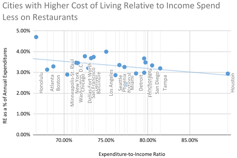
These findings could indicate that the amount people spend on restaurants is tied to how affordable their city is across the board—with people in more affordable areas spending more on restaurants, and people in less affordable areas spending less.
Restaurant Spending as a Percentage of Discretionary Spending
We also looked at restaurant spending as a percentage of discretionary, or non-essential, spending, to try to learn how restaurant spending stacks up alongside other voluntary spending categories.
For the purpose of this analysis of restaurant spending trends, discretionary spending includes: food away from home (the category that includes restaurant spending); alcohol; entertainment; personal care; reading; tobacco; miscellaneous spending; and cash contributions (which includes things like donations or contributions to a political party).
Once again, Honolulu topped the list, with consumer units allocating 30.68% of their discretionary spending budgets toward restaurant spending. This is substantially higher than any other city included in this study, and is far higher than the national average, showing that, when it comes to life’s “nice-to-haves,” people there put a uniquely high premium on dining out.
Restaurant Spending as a Percentage of Discretionary Spending
| Location | Average Annual Expenditures | Discretionary Spending (DS) | DS as a % of Annual Spending | RE as a % of DS | RE/DS Rank |
|---|---|---|---|---|---|
| National | $70,052 | $12,372 | 17.66% | 18.49% | – |
| Honolulu | $74,965 | $11,500 | 15.34% | 30.68% | 1 |
| Los Angeles | $77,024 | $12,231 | 15.88% | 25.20% | 2 |
| Dallas-Fort Worth | $71,932 | $11,676 | 16.23% | 23.30% | 3 |
| Denver | $84,293 | $14,052 | 16.67% | 22.14% | 4 |
| Atlanta | $72,537 | $10,548 | 14.54% | 21.59% | 5 |
| San Francisco | $101,880 | $15,578 | 15.29% | 21.04% | 6 |
| Chicago | $74,266 | $12,369 | 16.65% | 20.74% | 7 |
| Tampa | $67,636 | $10,476 | 15.49% | 20.65% | 8 |
| Baltimore | $82,095 | $15,193 | 18.51% | 20.25% | 9 |
| New York | $83,064 | $13,658 | 16.44% | 20.10% | 10 |
| St. Louis | $71,182 | $13,460 | 18.91% | 19.44% | 11 |
| San Diego | $86,299 | $14,942 | 17.31% | 19.29% | 12 |
| Phoenix | $71,750 | $12,543 | 17.48% | 19.22% | 13 |
| Boston | $89,795 | $15,635 | 17.41% | 18.91% | 14 |
| Washington, D.C. | $94,171 | $17,641 | 18.73% | 18.53% | 15 |
| Philadelphia | $85,897 | $16,427 | 19.12% | 18.22% | 16 |
| Detroit | $68,866 | $11,205 | 16.27% | 18.16% | 17 |
| Miami | $64,943 | $9,279 | 14.29% | 16.94% | 18 |
| Anchorage | $82,799 | $15,423 | 18.63% | 16.05% | 19 |
| Minneapolis-St. Paul | $82,883 | $15,725 | 18.97% | 15.29% | 20 |
| Seattle | $93,905 | $18,557 | 19.76% | 14.53% | 21 |
| Houston | $73,772 | $16,595 | 22.49% | 13.09% | 22 |
Digging further into the data, we can see that discretionary spending as a percentage of total annual spending remains more or less flat regardless of an area’s pre-tax income—while restaurant expenditures as a percentage of discretionary spending generally increases with increased average income.
These trends are highlighted in the following chart.
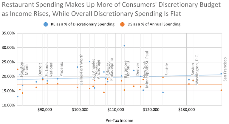
This indicates that consumer units across these MSAs tend to allocate roughly the same proportion of their budget to discretionary spending, regardless of how much money they make; but within that discretionary budget, consumer units allocate more toward restaurant spending in higher earning areas.
Restaurant Spending as a Percentage of Food Spending
Another category we analyzed while exploring U.S. city dining habits was restaurant spending as a percentage of overall food spending, to try to get an idea of what share of consumers’ total food budget is going toward restaurants.
Here, Honolulu’s reign came to an end; Houston topped the list in this category, with consumer units allocating 31.72% of their overall food budgets toward eating at restaurants. Given that Houstonians spend the least on food out of the MSAs we looked at, this could mean that people there are taking advantage of relatively low food prices to enjoy the city’s vibrant, multicultural food scene.
Restaurant Spending as a Percentage of Food Spending
| Location | Total Food Expenditures | Food as a % of Total Annual Expenditures | RE as % of Total Food Expenditures | RE/Total Food Expenditures Rank |
|---|---|---|---|---|
| National | $8,818 | 12.59% | 25.95% | – |
| Houston | $6,849 | 9.28% | 31.72% | 1 |
| Denver | $9,876 | 11.72% | 31.50% | 2 |
| Dallas-Fort Worth | $8,755 | 12.17% | 31.07% | 3 |
| Los Angeles | $10,174 | 13.21% | 30.29% | 4 |
| Phoenix | $8,330 | 11.61% | 28.95% | 5 |
| Washington, D.C. | $11,326 | 12.03% | 28.86% | 6 |
| Baltimore | $10,661 | 12.99% | 28.86% | 7 |
| Philadelphia | $10,492 | 12.21% | 28.53% | 8 |
| San Diego | $10,449 | 12.11% | 27.59% | 9 |
| St. Louis | $9,519 | 13.37% | 27.49% | 10 |
| Chicago | $9,371 | 12.62% | 27.37% | 11 |
| Honolulu | $12,941 | 17.26% | 27.26% | 12 |
| Boston | $10,873 | 12.11% | 27.19% | 13 |
| Tampa | $8,022 | 11.86% | 26.97% | 14 |
| New York | $10,643 | 12.81% | 25.79% | 15 |
| Seattle | $10,497 | 11.18% | 25.69% | 16 |
| Minneapolis-St. Paul | $9,416 | 11.36% | 25.54% | 17 |
| Atlanta | $9,075 | 12.51% | 25.10% | 18 |
| San Francisco | $13,137 | 12.89% | 24.95% | 19 |
| Detroit | $8,464 | 12.29% | 24.04% | 20 |
| Anchorage | $12,172 | 14.70% | 20.34% | 21 |
| Miami | $7,992 | 12.31% | 19.67% | 22 |
Our analysis of this category supports that idea; the data revealed that, in areas where people allocated less of their overall budgets toward food, they actually spent more of their food budgets on restaurants—as indicated in the chart below.
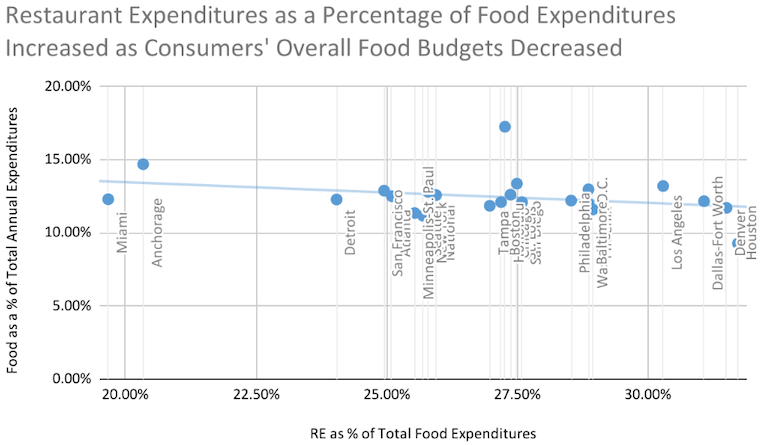
This finding could suggest that, in places where food is generally more affordable, people are choosing to eat out more often.
Restaurant Spending per Capita
Finally, we also looked at restaurant spending per capita, which enabled us to leave behind the concept of consumer units and directly compare restaurant spending per person across the MSAs we evaluated.
Boston placed first here, with residents spending an average of $1,343.78 per capita on restaurants; that’s more than double the per capita spending in Miami, which, at $683.51, was the lowest-ranked MSA we surveyed. These results may not be surprising, as Boston also had the highest per capita income of this study—suggesting that people in this high-income area are both more willing and more able to hit the town.
Restaurant Spending per Capita
| Location | Per Capita Income | RE per Capita | RE per Capita Rank |
|---|---|---|---|
| National | $37,802 | $953.27 | – |
| Boston | $59,392 | $1,343.78 | 1 |
| San Francisco | $55,904 | $1,311.14 | 2 |
| Honolulu | $40,157 | $1,260.03 | 3 |
| Washington, D.C. | $50,700 | $1,257.28 | 4 |
| Denver | $46,045 | $1,244.50 | 5 |
| Baltimore | $44,658 | $1,230.79 | 6 |
| Philadelphia | $43,099 | $1,197.33 | 7 |
| St. Louis | $40,666 | $1,189.52 | 8 |
| Los Angeles | $39,480 | $1,185.30 | 9 |
| San Diego | $42,873 | $1,153.18 | 10 |
| Seattle | $51,390 | $1,123.81 | 11 |
| New York | $46,819 | $1,098.06 | 12 |
| Chicago | $43,183 | $1,068.68 | 13 |
| Anchorage | $43,358 | $1,031.54 | 14 |
| Dallas-Fort Worth | $36,753 | $1,007.58 | 15 |
| Minneapolis-St. Paul | $49,066 | $1,001.83 | 16 |
| Tampa | $37,732 | $983.52 | 17 |
| Phoenix | $37,464 | $964.50 | 18 |
| Detroit | $39,828 | $924.94 | 19 |
| Atlanta | $39,518 | $843.54 | 20 |
| Houston | $29,422 | $775.95 | 21 |
| Miami | $36,416 | $683.51 | 22 |
One thing that immediately jumps out from this table is that, of the five categories we’ve examined, this one has the highest number of MSAs coming in above the national average; only four of the 22 MSAs we looked at ranked lower than the national average here.
What conclusion can we draw from this? That restaurants are simply more expensive in major cities than in other parts of the country?
The data tell a different story—as illustrated in the following chart, which shows consumer unit expenditure-to-income ratios falling and per capita restaurant expenditures rising as per capita income increases.
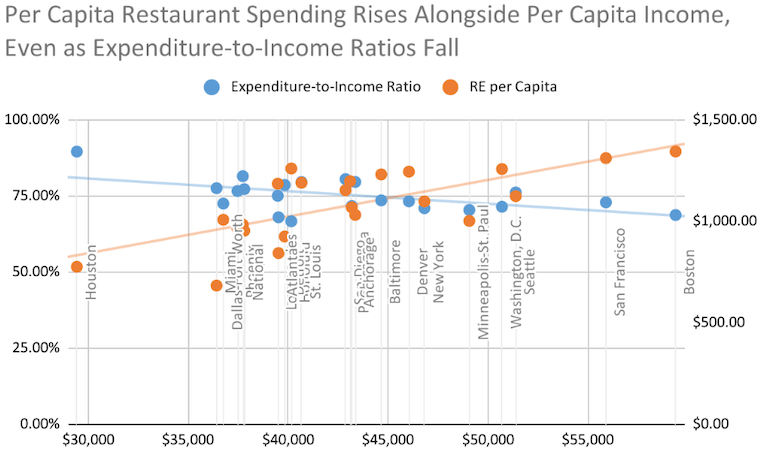
This indicates that increased per capita restaurant expenditures may not just be a function of a higher cost of living in urban settings—because the expenditure-to-income ratio decreases in MSAs with higher income levels.
This could suggest that increased per capita restaurant spending in higher income areas is because people really are eating out more often than in areas with a higher cost of living.
Methodology and Notes
To obtain these findings, Escoffier first examined data from the USDA’s FES—a data set that measures how much Americans spend on food.1 Food expenditures are broken into two broad categories—food at home (FAH), and food away from home (FAFH)—which, in turn, are split into subcategories.
The data revealed that restaurant expenditures as a proportion of FAFH expenditures have been remarkably consistent dating back to 1997, the first year included in the data set; over the 27 years encompassed by the data, restaurant expenditures made up an average of 68.56% of total FAFH expenditures nationwide.
We then applied that average to data from the Bureau of Labor Statistics’ CES, which presents consumer expenditures across a variety of spending categories in addition to other economic data.2 We used the most recent surveys available (2021-2022), which included data from 22 major metropolitan statistical areas (MSAs); we also examined national data from the same survey.
By applying the historical average we obtained from the FES data to the expenditure data from the CES, we were able to approximate U.S. city dining habits by estimating restaurant expenditures for each individual MSA—which enabled us to analyze restaurant expenditures in the context of various other data points.
Study Limitations
There are a few caveats to this analysis that we would like to point out.
First, there may be local variations in restaurant spending as a percentage of total FAFH spending, which would affect the scores for each MSA. As we were unable to obtain reliable data on local restaurant expenditures as a percentage of FAFH, our next-best option was to apply the national average to each locality.
Second, this analysis is limited to the MSAs encompassed by the CES data. While this group of MSAs closely corresponds to the largest MSAs in the country (19 of the MSAs in this study are among the 20 largest MSAs in the country), they do not exactly match. As such, our analysis presents a snapshot of dining habits across major American MSAs; it should not be interpreted as presenting data for the 22 largest MSAs.
This study highlights significant local and regional differences in restaurant spending trends across the U.S. Whether the trends are driven by income, cost of living, local culture, or other factors, these insights can inform business strategies for restaurant owners and aspiring chefs alike.
Sources
- (1) USDA Economic Research Service Food Expenditure Series, Nominal food and alcohol expenditures, with taxes and tips, for all purchasers
- (2) U.S. Bureau of Labor Statistics Consumer Expenditure Surveys, national and MSA-level data (2021-2022)
